
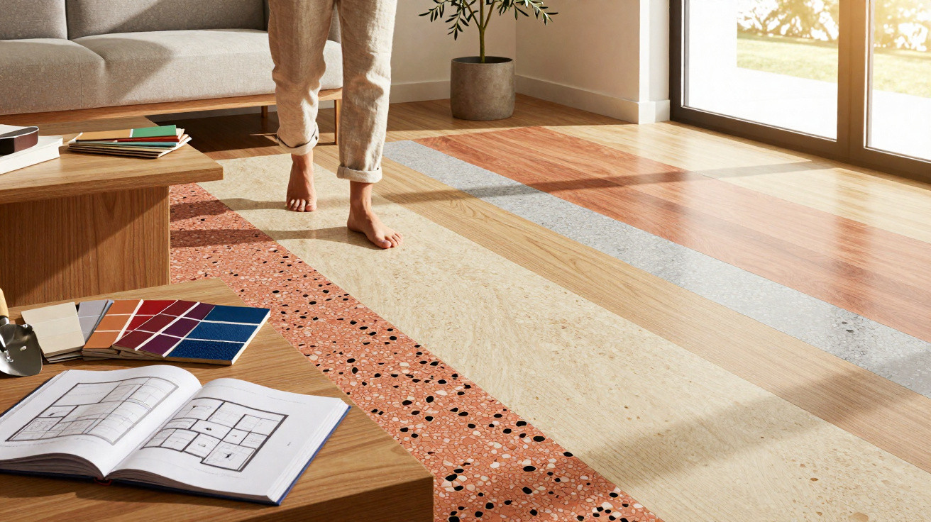
Wood-effect tiles were considered a safe bet for years.
In 2026, that trend is turning - making way for bolder, more characterful surfaces.
Anyone refurbishing a bathroom, kitchen or hallway now is far less likely to choose wood-effect tiles. Specifiers, interior designers and self-builders are gravitating towards finishes that feel more visible, more honest and more tactile. Natural stone looks, handmade ceramics, XXL formats and confident colours are shaping new ranges - and, with them, the appearance of contemporary flats and houses.
Why wood-effect tiles are losing their appeal
For a long time, wood-look ceramic tiles filled a gap: the warmth associated with timber flooring, paired with the practicality and easy cleaning of ceramic. In many new-builds, this created floors that - at first glance - resembled oak or walnut, but were wipe-clean and hard-wearing.
It is precisely this “as if” quality that is now prompting a shift in taste. Many homeowners want less imitation and more authenticity. On top of that, wood-effect tiles have been installed extremely widely over the last ten years - especially in rental flats, hotels and spa/wellness areas. To many, the look now feels played out.
"In 2026, the focus moves to a genuine material feel - textures that do not pretend to be something else."
In place of simulated wood grain, the spotlight is moving to raw stone-like surfaces, visibly fired ceramics and brave blocks of colour. Manufacturers are responding with ranges that are noticeably broader - less about illusion, more about personality.
Natural stone look: travertine and similar finishes make a comeback
One of the biggest winners as wood-effect falls out of favour is tile design inspired by natural stone. Travertine in particular - with its warm beige tones and irregular pores - is seeing a strong resurgence.
Typical features of this look include:
- gentle, warm shades from cream through to sand
- irregular veining and inclusions
- matt or satin-matt finishes
- formats that echo natural stone slabs
Used in living and dining spaces, it creates a relaxed, Mediterranean feel. On terraces or balconies, it can read like an extension of that holiday atmosphere. Interior designers often choose travertine effects to soften crisp, modern furniture with a warmer, more forgiving base.
Earth underfoot: terracotta returns
Tiles made from fired clay - often associated with terracotta or tomette floors - were long seen as a leftover from 1990s country-style kitchens. In 2026 they are reappearing in updated versions: less rustic, and used with more intention.
Typical characteristics are:
- smaller formats, often hexagonal or square
- tones ranging from brick red and rusty orange to fired ochre
- matt, slightly powdery surfaces
- clearly visible, sometimes irregular edges
In kitchens, these floors add noticeable warmth; in living rooms they bring an almost craft-led quality. If you worry about tipping into too much “Tuscan kitsch”, pair terracotta with very clean, modern kitchen fronts, plenty of white, and stainless steel.
Terrazzo reimagined: from old-fashioned floor to design statement
Terrazzo used to be thought of as a school-corridor surface. Today, it is one of the most versatile tools for shaping modern interiors. Contemporary terrazzo-effect tiles borrow the idea - coloured stone chips set in a cement- or resin-bound matrix - while avoiding the upkeep associated with the real material.
Particularly in demand are versions with:
- fine aggregate in muted natural tones for use throughout the home
- large, colourful inclusions as an eye-catcher in bathrooms or kitchens
- a lightly polished finish for a subtle sheen
"Terrazzo strikes a balance: enough pattern to feel interesting, yet calm enough not to irritate."
Designers like using it across entire bathrooms: floor, shower and vanity area in one continuous look. The result feels premium without becoming cold.
Handmade ceramic: Zellige tiles with edges and character
Handmade, glazed ceramic tiles in a North African style - often referred to as Zellige - bring a different kind of luxury into the home: not flat and flawless, but lively and gently irregular.
They are defined by:
- small formats, usually square
- uneven surfaces with slight waves and imperfect edges
- rich glazes - from deep navy through emerald green to creamy white
- strong light play created by the glossy glaze
These tiles are popular as a kitchen splashback, in a cloakroom, or as a shower feature wall. Each piece looks a little different, creating a vibrant, almost shimmering overall effect - a clear counterpoint to the once-dominant, smooth wood-effect finish.
XXL formats: fewer grout lines, more calm
Alongside the appetite for more authentic surfaces, there is also growing demand for larger tile sizes. Squares of 100 x 100 centimetres - or even 120 x 120 centimetres - are no longer unusual.
| Format | Effect in the room | Typical areas of use |
|---|---|---|
| 60 x 60 cm | calm, classic | hallway, living room, standard bathrooms |
| 80 x 80 cm | modern, spacious | open-plan living areas, larger kitchens |
| 100 x 100 cm | almost seamless, very crisp | design-led bathrooms, loft flats |
| 120 x 120 cm and larger | monolithic, almost like a poured floor | large entrance areas, showrooms, luxury living spaces |
With fewer visible grout lines, rooms tend to feel larger and more composed. In smaller bathrooms especially, a continuous large-format floor often looks far more refined than a patchwork of wood-imitation planks.
Confidence with colour: from soft red to deep midnight blue
Another clear break from wood-effect - typically limited to browns and beiges - is the evolving colour palette. In 2026, many collections lean into strong shades that are deliberately nuanced rather than harsh.
Trending choices include:
- soft reds with a slight rosy note for hallways or living rooms
- light, vivid yellows as an accent in kitchens or children’s bathrooms
- deep dark blue for bedroom walls and elegant dining areas
- pairings of powdery brown and dusty pink for calm, warm room moods
"Colour is moving into areas that were previously designed almost by reflex in grey, beige or wood-effect."
The key is committing to a clear approach: either the floor becomes the colourful stage while furniture stays neutral - or the other way around. If both are brightly coloured, visual clutter can appear quickly.
Texture instead of print: relief and 3D surfaces
Rather than relying on printed wood grain, many manufacturers are now leaning into true tactility. Relief textures, waves, grooves and 3D patterns add depth to walls - and increasingly to floors too.
Popular options include:
- ribbed tiles in bathrooms, often limited to one feature wall
- matt, lightly granular finishes with an earthy, natural feel
- geometric 3D patterns for hallways or stairwells
These textures create interest even without bold colours. On shower walls in particular, they can read like integrated artwork - and feel noticeably more premium to the touch than smooth wood-effect decors.
What self-builders and renovators should focus on now
If you are building or refurbishing in 2026 and want to move away from wood-effect tiles, a few practical points are worth keeping in mind:
- Consider room size: a natural-stone effect in very small formats can become visually busy; XXL tiles need enough uninterrupted floor area.
- Check light levels: dark blues or browns generally suit well-lit rooms; matt terracotta can work well in slightly darker spaces.
- Be realistic about cleaning: heavily textured surfaces disguise water marks and soap residue better, but can require more thorough cleaning.
- Choose grout colour deliberately: tone-on-tone grout makes surfaces feel calmer; contrasting grout emphasises the grid.
Especially with natural stone and terrazzo looks, it is worth bringing a sample piece home. Under exhibition lighting many surfaces read differently than they will in your own space.
How the new trends can be combined
It becomes most interesting when you mix these directions with intent. One example: a large-format stone-effect floor, paired with a handmade-ceramic kitchen splashback, plus a saturated midnight-blue accent in the dining area. That creates a considered interplay of calm, craftsmanship and colour.
A deliberate contrast can work just as well: a cooler terrazzo floor combined with a warm, earthy terracotta runner in the entrance hall. The guiding rule remains to give each room one clear lead role - either texture, colour or format.
If you are choosing finishes today, you no longer have to decide between “wood-effect or laminate”. The range runs from Mediterranean stone character and earthy ceramics to bold, coloured statement surfaces. That is exactly why it is worth taking a second look at ranges that may not sit on the first shelf in the showroom - but can give your rooms far more personality than yet another wood-decor floor.


Comments
No comments yet. Be the first to comment!
Leave a Comment