
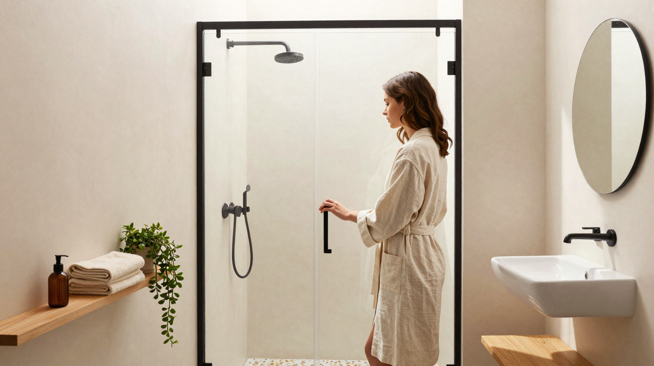
A studio measuring just 15 square metres with a hopelessly outdated wet room sounds like the classic big-city compromise. That was exactly the starting point in a flat in Paris’s 13th arrondissement: a battered corner with a combined toilet-and-shower setup, barely any proper fittings, and absolutely no charm. A design studio transformed it into a surprisingly comfortable, up-to-date retreat-showing how much potential even the smallest “box room” can hold.
From problem space to feel-good zone
The original wet room felt stuck in another era. A basic hand basin, bare walls and a very makeshift shower arrangement defined the space. The shower and toilet were crammed into the same microscopic footprint. If you wanted to shower, you first had to shut the toilet lid and then stand in virtually the same square metre as the ceramics.
From a design perspective, nothing had been thought through: no storage, no considered lighting, and no materials you’d actually want to touch. It was functionality on its lowest setting-and even that worked poorly.
"The old wet room wasn’t a bathroom but a stopgap-pushed to the limit functionally and a total write-off visually."
Strategic planning on 15 square metres
The studio itself is barely bigger than a medium-sized living room, so the layout only works if every centimetre earns its keep. The planners chose to rethink the wet area from the ground up, relying on disciplined space efficiency throughout.
The key move was simple but decisive: the vanity unit was shifted into a corner. That one adjustment freed up the circulation space and, for the first time, made a clear separation between the toilet area and the shower zone possible. A wall-hung toilet replaced the old floor-standing model, creating more visible floor area and making cleaning noticeably easier.
Across the board, the fixtures were selected in compact versions designed for small rooms: a slim shower screen, a space-saving heated towel rail, and a short vanity cabinet that isn’t overly deep. Nothing is accidental-every piece has a precisely defined footprint.
- Vanity positioned in the corner to gain usable floor space
- Wall-hung toilet instead of a floor-mounted unit for a lighter look and easier cleaning
- Narrow shower screen to make access simpler
- Compact heated towel rail that combines heating and a handy resting place
- Under-sink cabinet providing storage for everyday bathroom essentials
The result is a layout that turns a cramped, chaotic corner into a clear, easy-to-navigate plan that feels intuitive in daily use.
Design concept: soft shapes meet black metal
For the new look, the designers avoided gimmicks but introduced confident accents. The overall linework stays gentle and rounded: the mirror, sanitaryware and accessories follow a softer design language. That takes away any clinical harshness and makes the tiny bathroom feel more lived-in.
Tension comes from one strong contrast material: black metal. It appears in the mirror frame, the tapware, the shower profiles and other small details. Because it repeats, it creates a consistent visual thread through the room.
"Black metal accents work like a graphic frame, giving the mini bathroom structure and character."
The clever part is that the main area of the apartment already leans slightly industrial-through metal frames and darker lighting, for example. The redesigned wet room echoes that vocabulary. Instead of feeling like an add-on, it reads as a natural continuation of the home’s overall atmosphere.
A dark cubicle becomes a bright comfort zone
Before the refurbishment, the space felt dim and tight. Now, pale surfaces and carefully placed lighting points create a completely different mood. Tiles and painted areas bounce light around, while the glass shower screen lets the eye travel all the way to the wall without an optical barrier.
To stop daily routines turning into clutter, storage was treated as essential: the vanity cabinet holds toiletries and cleaning supplies, while open shelves or hooks keep towels close at hand without making the room feel overfilled. The payoff is that tidiness happens almost by itself-even if you don’t keep it perfectly organised every day.
Key lessons for small bathrooms
If you’re facing a tiny bathroom and feeling fed up with ageing sanitaryware, this project offers a few practical takeaways. Many of the ideas translate well to rented flats in the UK, sometimes even without major structural work.
| Problem | Possible solution |
|---|---|
| Not enough room to move | Shift the basin into a corner; choose a slim vanity unit |
| Dark, oppressive feel | Light wall finishes; glass instead of a curtain; clean, simple lines |
| Lack of storage | Tall units; mirrored cabinet; make use of corners |
| Toilet and shower “stuck” together | Wall-hung toilet and a narrow shower screen; define clear zones |
| Visually busy overall look | Use only a few materials and colours, repeated consistently |
How tenants and owners can plan realistically
Not everyone can move walls or completely reroute plumbing. Even so, it’s worth taking a hard look at what’s happening: where is space being wasted, and which items are oversized for the room? An overly deep basin or a bulky radiator often blocks movement and sightlines for no good reason.
Especially in older buildings, slimline products designed for mini bathrooms can make a big difference. Many DIY retailers and online shops sell ranges with shortened toilets, narrow basins and compact radiators. The cost is usually no higher than standard sizes, but the impact on usability can be dramatic.
It can also be worthwhile speaking to a specialist. An experienced interior architect can quickly spot where pipework can be combined, which wall is strong enough for a wall-hung toilet, and how to position a shower so it doesn’t visually “eat” the room.
Materials and colours: small area, big impact
In very small bathrooms, the material concept often matters even more than in a large spa-style room. Too many patterns or sharp colour changes can make the space feel jittery and even tighter. In this project, the base palette stays calm and understated. Texture and contrast do the work, rather than loud colour accents.
Typical combinations that work well in tight spaces include:
- Light, matt wall tiles paired with black tapware
- Wood-effect finishes on the floor or furniture to bring warmth
- Large-format tiles instead of mosaic, so fewer grout lines are visible
- One consistent colour across the ceiling and any untiled walls
With choices like these, a bathroom can feel more generous than the floor plan suggests. Your gaze “catches” less and can move through the space-a psychological trick that significantly increases the perceived sense of room.
More quality of life after work
In the end, this isn’t only about looks. Coming home after a long day to a tidy, well-designed bathroom makes it easier to switch off. In studio flats where the kitchen, bed and desk often blur into one, a properly functioning wet area becomes a kind of mini retreat.
This project shows how strongly quality of life can improve within just a few square metres. A former trouble spot becomes one of the home’s best features. Instead of being annoyed by a wobbly toilet-shower combo, the resident can look forward to a hot shower in a space that feels considered, modern and unexpectedly welcoming.
So if you’re tackling your own tiny bathroom, you don’t need to dream of a luxury spa. Often, a clear plan, restrained materials and the confidence to commit to one bold detail-such as black metal accents-are enough to turn a run-down corner into a genuine favourite spot.




Comments
No comments yet. Be the first to comment!
Leave a Comment